Particle HTML Template Documentation
GET A FREE 3D HOVER EFFECT
EXCLUSIVELY FOR PARTICLE THEME OWNERS
3D PARALLAX IMAGE HOVER EFFECT
Subscribe to our Newsletter (we never SPAM!) and be the first to get the coolest image hover effect for FREE!

TRY IT
3D Parallax Hover Image
Send download link to:
Please use a desktop computer if possible for best experience. This documentation was designed for larger screens.
Particle HTML Theme
Created: 02/09/2017
Latest Update: 19/10/2022
Version: 2.0.1
By: Skilltech
Website: www.skilltechwebdesign.com
Thank you for purchasing Particle HTML Theme! If you like our template, please give it 5 stars on Envato so we can create even better themes. If you have any questions that are beyond the scope of this help file, please feel free to email us.
Update History
V2.0.1 (OCt.19.2022)
- “Simple Forms” update to Version 3.0.10 – This is the bundled forms plugin that you get with Particle. For users who have set up simple forms before version 2.0.1, you will need to overwrite the old files and set up the new form configuration files. Here’s how:
- Main <form> id was changed from id=”contact-form” to id=”contact-form-1″, also, change minlength=”2″ to min=”2″ (minlength is now just min). Our suggestion is to open up all files in your code editor and mass-replace id=”contact-form” with id=”contact-form-1″ and in a second search replace minlength=”2″ with min=”2″.
- “assets/js/form.js” must be replaced and set up again by following the instructions
WE RECOMMEND BACKING UP YOU OLD form.js FILE JUST IN CASE. - The entire folder “assets/vendor/simple-forms/” must be replaced with the new one. WARNING! THIS WILL DELETE YOUR config.php FILE WHICH IS OK BECAUSE YOU WILL NEED TO SET UP THE NEW BLANK config.php FILE (NEW VERSION) BUT NEVERTHELESS YOU MIGHT WANT TO KEEP A BACKUP OF YOUR PREVIOUS SETUP.
- After you’ve done these replacements, you can continue to Forms section and follow the instructions like you did the last time (to set up form.js and config.php with your email and ReCaptcha info)
V2.0.0 (Apr.1.2021) – MAJOR UPDATE
- Complete code rewrite
- Design upgraded
- Improved responsive behavior
- Fixed Apple related issues
- Added Blog static pages
- Added fully working Premium forms (“Simple Forms”, added value $15)
- Contact Forms
- Subscribe Forms
- Added “Dark Mode” option/switcher
- Added sub-menus option CSS/Design (3 levels in total)
- Redesigned mobile menu, Slide-in style
- Re-added jQuert Easing Dependency
- Added animated page preloader
- Added animated page transitions
V1.0.2 (Feb.2.2019)
- Fixed layout issues on IOS on smaller screens
- Removed jquery easing dependency
- Fixed HTML5 videos issues on Chrome
V1.0.1 (Nov.7.2017)
- Initial Release
Previous Versions
If you’re using previous versions, you can open the “_Documentation – Old” folder and launch the old documentation. IMPORTANT: Version 2 has a complete code rewrite so it is NOT advisable to try and update from V1 to V2, instead, it is more efficient to replace text and images on the new template and do your custom tweaks on it.
Getting Started
When you download the theme files, you will see a large number of HTML files (including favicon.png) and the “Website\assets” folder. The first thing you will do is to choose the layout you want and delete the unneeded files. The “Website\assets” folder contains all other files including images, videos, CSS, JS, PHP… After deleting the unneeded HTML files you will do the same with the assets. Here’s what you need to do:
Selecting the files (and deleting unneeded ones)
1. Duplicate the “Website” folder (entire project folder)
Make a copy of the “Website” folder from your downloaded files. This way you’ll always have the original code handy. Rename the duplicated folder to what you want and open it. You will continue working on files inside this new folder.
Now you can follow step 2. below or use our Wizard to quickly select your layout.
Layout Selection Wizard
It's easy and you can reset at any time.
Which homepage do you want to use?
Hero Image - Light (default) Hero Video(HTML5) - Light Hero YouTube Video - Light Hero Image - Dark Hero Video(HTML5) - Dark Hero YouTube Video - DarkWill you use blog?
Yes NoWhich blog would You like?
Light DarkWhat Blog Feed style do you want?

Magazine

Casual

Classic
Do you want sidebar on your blog?
Yes NoOn which side to put the sidebar?
Right LeftThese are the .html files you should keep
                service-item.html

                portfolio-item.html
These are the files from the "assets" folder you can Delete
2. Choose a homepage
NOTE: If you used the wizard and got and deleted your files you can skip to HTML Structure.
When you choose the homepage, you can delete the rest of the homepage files from this list below (to preview, open any HTML file in your browser).
index.html ===============> (Hero Image - Light - Default)
index-video.html =========> (Hero Video(HTML5) - Light)
index-yt-video.html ======> (Hero Video YouTube - Light)
dark-index.html ==========> (Hero Image - Dark)
dark-index-video.html ====> (Hero Video(HTML5) - Dark)
dark-index-yt-video.html => (Hero Video YouTube - Dark)
3. Delete JS files you won’t need
Open the “assets” folder and inside it open the “js” folder.
If you selected a light homepage, delete the “dark” titled .js file and vice versa.
If you’re not using YouTube homepage, delete the youtube js file.
page-home.js ======> JS for light homepages
page-home-dark.js => JS for dark homepages
youtube-video.js ==> JS for YouTube video background
4. Delete videos you won’t need
Open the “assets” folder and inside it open the “video” folder.
If you are using light video (HTML5) homepage, delete the dark video files and vice versa. If you are using YouTube video homepages delete both videos. For the videos you delete, you can delete the .jpg files as well.
particle-video-dark.mp4 ===> Video for index-video.html
particle-video-light.mp4 ==> Video for index-video-dark.html
5. Delete Blog HTML files you won’t need
If you will NOT use blog, you can delete ALL .html files that start with:
- blog-…html
- dark-blog-…html
- single…html
- dark-single…html
assets\js\page-blog.js
assets\js\page-blog-single-post.js
assets\css\particle-blog.css
If you will be using blog
You will need one “blog” page (for the feed) and one “single” page (for your individual articles). Based on whether or not you want to use a sidebar (and on which side) and whether you want light or dark Blog (and of which style) version you will select select your two files.
This is an example of selecting the files:
- Do you want a light or a dark blog? ==> DARK
- What style (Magazine, Casual or Classic)? ==> CLASSIC
- Sidebar Position (left, right, no-sidebar)> ==> LEFT
Based on these choices, I would keep:
- dark-blog-classic–sidebar-left.html
- dark-single-sidebar-left.html
Here is the entire list of blog pages:
-----
Blog page (pick one, delete the rest)
-----
blog-casual-no-sidebar.html
blog-casual-sidebar-left.html
blog-casual-sidebar-right.html
blog-classic-no-sidebar.html
blog-classic-sidebar-left.html
blog-classic-sidebar-right.html
blog-magazine-no-sidebar.html
blog-magazine-sidebar-left.html
blog-magazine-sidebar-right.html
dark-blog-casual-no-sidebar.html
dark-blog-casual-sidebar-left.html
dark-blog-casual-sidebar-right.html
dark-blog-classic-no-sidebar.html
dark-blog-classic-sidebar-left.html
dark-blog-classic-sidebar-right.html
dark-blog-magazine-no-sidebar.html
dark-blog-magazine-sidebar-left.html
dark-blog-magazine-sidebar-right.html
-----
Single page (pick one, delete the rest)
-----
single-no-sidebar.html
single-sidebar-left.html
single-sidebar-right.html
dark-single-no-sidebar.html
dark-single-sidebar-left.html
dark-single-sidebar-right.html
Note: All blog pages have the ability to change the style and dark mode so no matter which two pages you select you will be able to let your users change it live to their liking (see Blog Feed Styler and Dark Mode Switch).
HTML Structure
This theme consists of five starting pages:
- Homepage
- Inner Service page (service-item.html – template for creating inner pages for services)
- Inner Portfolio page (portfolio-item.html template for creating inner pages for projects)
- Blog page (template for creating blog feed pages)
- Article (single) page (template for creating inner pages for blog articles)
Homepage
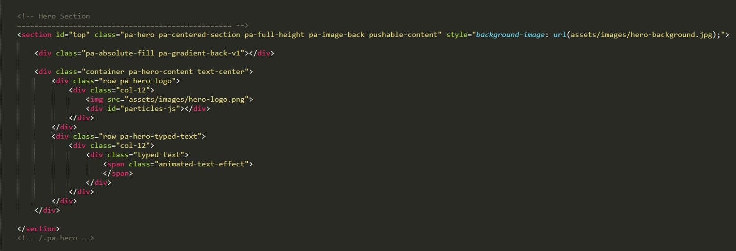
The main page, as well as other pages, is structured into sections, which are marked with large HTML comments, so you can navigate through the code easily.
Inner Service Page
The “Service” section from the homepage links (if you want) to the “inner” pages for each service. Duplicate the service-item.html page for as much services as you need. Particle theme’s design has a designated services section for six services with but you can create as many service pages as you’d like and link to them from wherever you like.
Inner Portfolio Project Page
The “Portfolio” section from the homepage links to the “inner” pages for each project. Duplicate the portfolio-item.html page for as much projects as you need. Particle theme’s design has a designated Portfolio section for four projects but you can create as many project pages as you’d like and link to them from wherever you like.
Blog Page
Blog page is comprised of 4 main sections:
- Hero section
- Posts Ticker and Search
- Featured section (pa-blog-featured)
- Main content (Blog Feed and Sidebar)
- Blog Feed column (pa-feed-col)
- Blog Sidebar column (if used – aside tag)
Blog Page > Posts Ticker and Search
“Blog Posts ticker” is the mini slider where you can put headings for the latest posts and link to articles from there. NOTE: Search function does not work. After all, this is a HTML template. Search design is there in case you integrate your own search functionality.
Blog Page > Featured Section
Featured section contains 3 differently styled, accented articles before the feed starts.
Blog Page > Article
Each article on the blog page (including the featured ones) is marked with “Article” comment and main blog feed articles are wrapped with “Articles Wrapper”.
Blog Page > Blog Feed Styler
The Blog Feed Styler is a cool option that lets your users restyle the blog on the live site. Explained in more detail later in the documentation.
Blog Page > Sidebar and Widgets
Sidebar contains useful widgets such as in real blog. NOTE: Search and share do not work. Related posts, tags, categories, calendar etc. are static. If you want search or share, you will need to integrate this functionality yourself. After all, this is a static HTML template, but we provide the design to take it further. Related posts, tags, categories, calendar etc. can work of course, after you create the content and link the demo content properly to your actual content. Each widget in the sidebar is marked with “Widget” comment. Subscribe form does work, but more on forms later.
Blog Page > Pagination
At the bottom of the Blog Feed column, you can find the “Pagination” navigation which you can use to create said navigation in case your blog has more than one page.
Article (single) Page
Each article from the Blog links to its “inner” page, called “Single”. Duplicate the “single” .html file you saved for as many articles as you want. Particle theme’s Blog design holds nine articles per blog page plus three featured articles (and the posts ticker with headings also linking to articles). Specific section worth mentioning on the “Single” page template is the “Post Bottom Details” which contain meta information about the post and its author. There is also the “Related Posts” section with a carousel of posts (owl-carousel), where each post is wrapped in the “pa-related-item” CSS class.
Ads
There are designated zones for ads throughout the blog and single pages. These zones are marked with “pa-ads” CSS class.
CSS Files and Structure
Besides the 3rd party libraries CSS files, Particle has 3 main CSS files located in “assets\css\”. These are:
- particle-theme.css
- particle-colors.css
- particle-blog.css
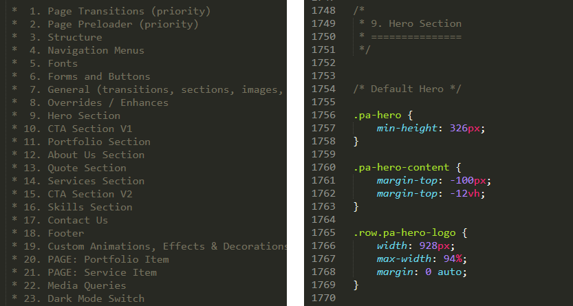
As with the main HTML File, CSS is organized in sections which are also marked with large comments for easy navigation. CSS file is structured to follow the sections order of the HTML file, so for each section of the main page, you have corresponding sections in the CSS but with one key difference – the beginning of the CSS file contains general rules (such as structure, fonts, forms, buttons…) and reusable classes (such as .pa-image-back) as well as priority code and navigation styling. At the end of the file (or a major/complex section), there are media queries, and for each viewport width, all the code follows the same principle, the sections that come in first in main HTML page, also come first in media queries. particle-blog.css also has “Dark Mode” colors right at the beginning of the file, for easy access and tweaking. Most of Particle’s CSS classes start with “.pa-” so you could differentiate them from e.g. Bootstrap’s classes or classes used by 3rd party scripts.
We are using some of the latest features of CSS, but all of the main things you will want to customize are very straight forward, as you will see later in the documentation.
Here is an example of the CSS code:
JavaScript
Other than JS libraries (explained later), the theme includes several JavaScript files, all located in “assets\js\”. The files are:
- particle-theme.js (Main Theme File)
- page-blog.js (used on Blog page)
- page-blog-single-post. (used on “Single” blog page)
- page-home.js (used on light homepages)
- page-home-dark.js (used on dark homepages
- page-portfolio-item.js (used on portfolio item page)
- page-service-item.js (used on service item page)
- youtube-video.js (used for YouTube video homepages)
If you want to add your own custom code, you will probably want to add it to particle-theme.js as this is the main theme file.
Third Party Libraries
Included with Particle comes third party content including CSS and JS as well as Premium forms solution. All third party content is located in “assets\vendor\” folder. Each folder inside that folder is named by the what it contains. These 3rd party libraries are included:
- Animate
- Bootstrap 4
- CounterUp
- jQuery
- Offcanvas Nav
- Owl Carousel
- Parallax by PixelCog
- Particles
- Simple Forms
- Typed
- Waypoints
- WOW
If you know how to code, you can visit documentation pages for each of these libraries if you wish to use them for your own custom work. The main customization specific for Particle Theme is explained below, under Customization.
Customization
Colors
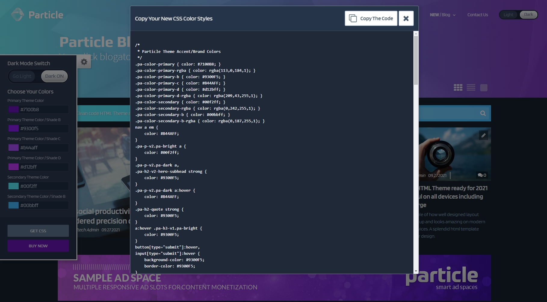
Probably the first thing you want to do is to change the main colors to suit your brand. All CSS code for the main colors is located in the “assets\css\particle-colors.css” file, so the customization can be done in one file.
NOTE: This file contains the Accent Colors, these are the 6 colors applied to important elements such as buttons, links, gradients, headings. On our demo, these colors are purple and neon-like greens and blues.
We made this customization incredibly easy, as you probably noticed on our demo page. You can choose the desired colors with our color picker, and see it in real time. When you are satisfied with the look, click on the “GET CSS” button, then on the “Copy The Code” and paste the copied code over the existing code in “assets\css\particle-colors.css” file.
Logos
There are two logo images used for menu and an additional “hero logo” image in case you are using a light homepage. To prepare your logos, do the following:
- prepare the “logo-normal.png” file (258px width, 100px height)
- prepare the “logo-mobile.png” file (120px width, 66px height)
- (if using light homepage) prepare the “hero-logo.png” file (928px width, 271px height)
When done, you can overwrite the existing logo files in “assets\images” Make sure you follow these dimensions for the best aesthetic results. And your logo should be white or very bright.
There are helpful AI files in “Mockups\AI” folder (inside your main download folder) for those of you using Adobe Illustrator which will let you create the same exact logo effect as on the hero section of light homepages. For those of you not using Illustrator, the font used in logo design is Prometo Bold, size 261pt.
Finally, you can use a .png compression website like tinypng.com to drastically reduce .png file size (we’ve loved this website, ever since we found it). This is helpful for the hero logo, which is pretty large.
PSD and AI mockups
As a bonus we included our own Premium PSD and AI files that are used in this theme. You can find them in the “Mockups” folder. There are two separate folders with AI and PSD mockups.
In PSD files, look for the “Your Design Here” or “PUT YOUR DESIGN HERE” object in the layers, double-click it, then paste your image in the new tab’s canvas area, press “X” to close the .psb tab and when prompted about saving click “Yes”. Then export your file using CRTL+ALT+SHIFT+S. Additionally, depending on whether you’re using light or dark theme, on some mockups you can change the background to dark (in the layers panel) by making the light background invisible.
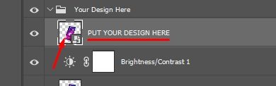
In AI files, simply follow the instructions inside the file.
Typed JS

Typed.js controls, you guessed it, the headings with the “typed” style effect. This is pretty easy to do, you just need to go to “assets\js” folder and enter your own text in JS files for each page where typed.js was used (the filenames start with “page-“):
- For homepage, open “page-home.js” or “page-home-dark.js” depending on which home you used
- For Blog, open “page-blog.js”
- For portfolio item inner pages, open “page-portfolio-item.js”, and
- For service item inner pages, open “page-service-item.js”
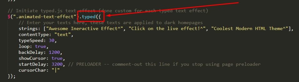
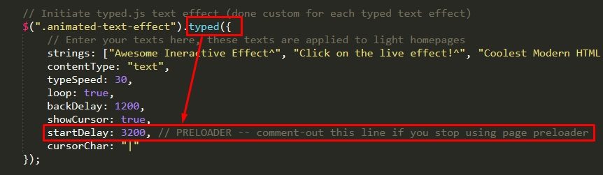
As shown in the image above, you need to find the line of code which contains “.typed({“, and then, inside the strings option replace our demo sentences with your own. You can use as many sentences as you’d like, whether it’s more or less than three. Finally, see the “startDelay” option. If you remove page preloaders we suggest commenting out that line with // in front of that line so your text doesn’t wait for 3.2 seconds before it starts the effect.
Skill bars
You have already set up the colors, the only thing left is to enter the percentages and labels to your skill bars.
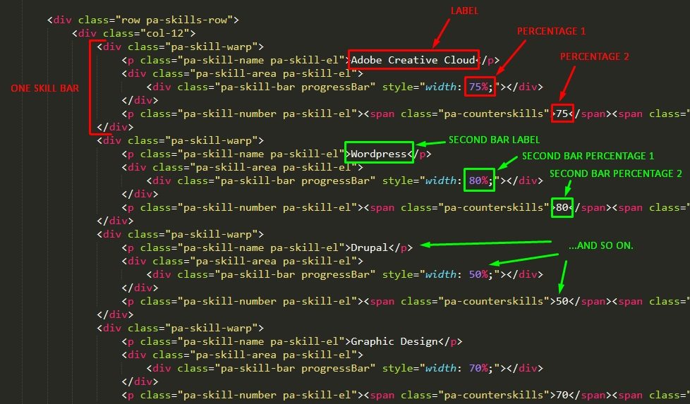
Video backgrounds
There are two type of video backgrounds available. So there are two different ways of customizing them. Before we continue do explain how to customize videos here are pros, cons and tips for each type of video background.
HTML5 Video Pros
Much more reliable to load since you depend on HTML international standards rather than Google, which is a private company and has on numerous occasions changed the API which broke YT video backgrounds.
HTML5 Video Cons
Video must be loaded fully in order to start. Large videos will choke your page load and make your website fail to pass speed tests.
Quality must be lowered and length of the video should be as little as possible.
HTML5 Video Tips
We suggest using a very short, but beautiful, video with small dimensions and to use a pattern overlay (dotty patterns are know to achieve an effect of a better quality image, which is perfect for covering pixelation).
YouTube Video Pros
You have the worlds leading video algorithm which will load high quality long video blazing fast, and you don’t burden your servers (hosting) with serving large files. In other words, saves money, better for long and HQ videos.
YouTube Video Cons
Google will surely change the API in the future making it more possible to break your site (or one you done for a client). These videos behave inconsistently across mobile devices and you can never bee entirely sure that your video will work everywhere.
YouTube Video Tips
We suggest using YouTube video backgrounds for special occasions, where longer video background is more important than being compatible with all devices out there.
To sum up, video backgrounds are exactly what they’re called, backgrounds! You should use them to emphasize your already beautiful website and you shouldn’t plan on your users watching a 10 minute video when it’s used as a background on your homepage. For that purpose exist normal videos with play controls, volume etc. And you should be mindful about the fact that video standards change and you can never be sure your videos will work 100% of the time across all devices, especially mobile.
HTML5 Self-hosted video backgrounds
You will need to prepare a .mp4 file and a .jpg “poster” file, which will be served as a backup. TIP: make your video short, in small dimensions and use a dotty pattern overlay (you have a dedicated pattern-overlay div already in code). When your files are ready, place them in the “assets/videos/” folder and update the filenames in the HTML file, shown below.

YouTube video backgrounds
Upload your video to YouTube or, if you already did, copy the video ID, this is the 11 character code located in the URL of every video, starting after “v=” characters.

Open the HTML file and paste in your copied ID over the existing one for the data-youtube-video-id attribute, as shown below.

Page transitions and Preloader
By default, Particle has page transitions effect a page loading animation known as page preloader integrated.
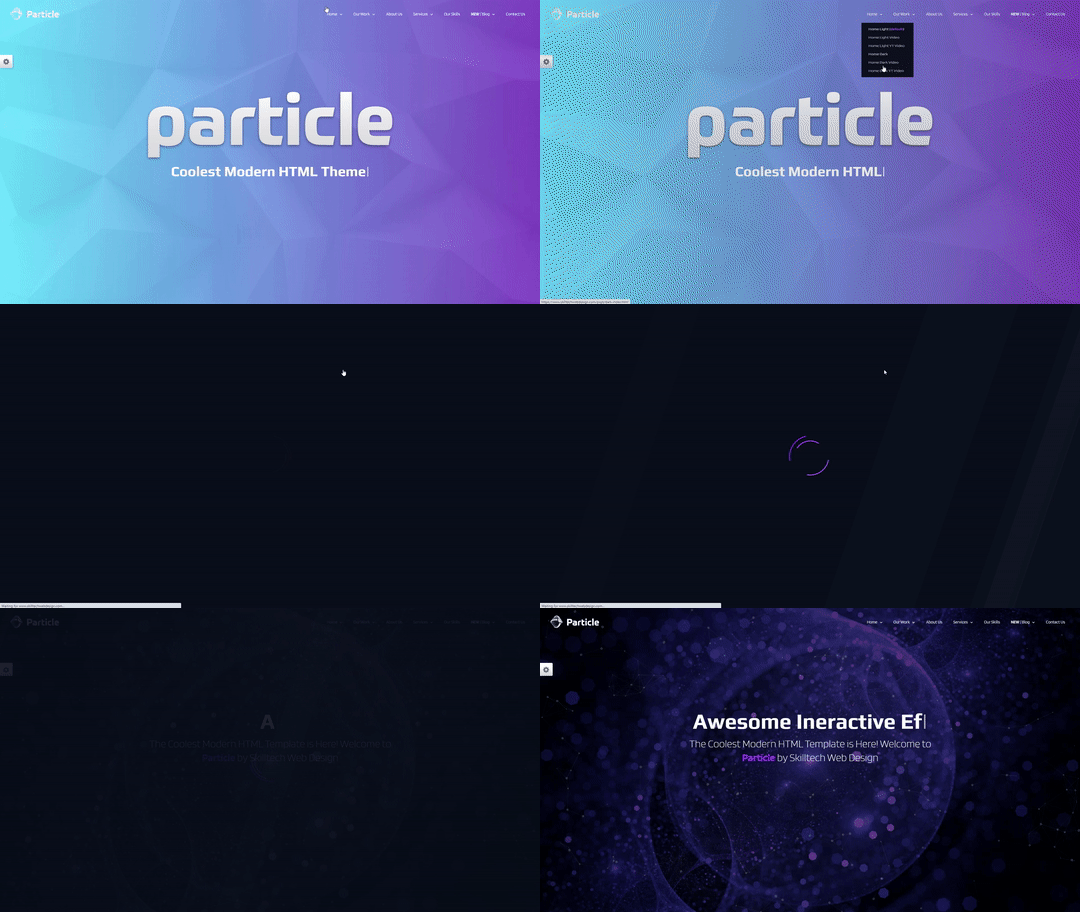
If you want to remove these effects you need to:
- remove divs used for overlay on the HTML pages
- remove HTML inserting code from particle-theme.js file
- remove the typed text effect delay (optional but worth it)
Firstly, on your HTML pages, find the comment marked “Page Transitions” at the very beginning of the body and remove the two divs below:
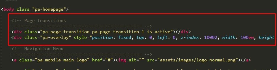
Second, open the “assets\js” folder and then open the particle-theme.js file. Now delete (or comment-out) the code between comments marked with // — START: Page Transitions and Preloader — // and // — END: Page Transitions and Preloader — //
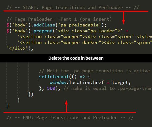
Finally, while still inside the “assets/js” folder, you can open every .js file that starts with “page-“, and remove (or comment-out) the line that delays the typed text effect as shown below:
Dark Mode

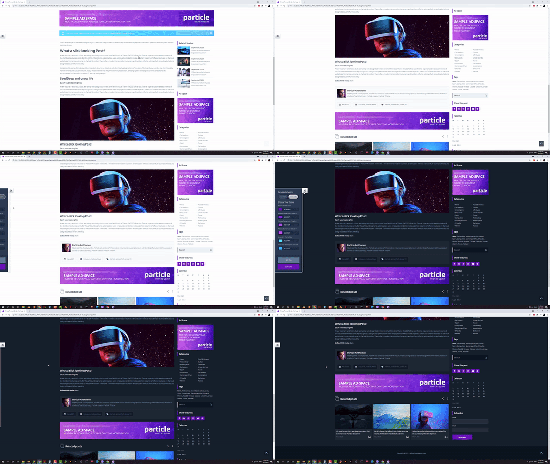
The theme includes a “Dark-Mode Switch”, a custom built menu button that changes the theme from light to dark and vice versa. Dark mode works on Blog pages. It works technically on all pages but Blog has been specifically restyled for this type of switching. How it works is simple, when clicking on the dark mode switch, body will receive “pa-dark-mode” class. To add the dark mode switch to the menu simply add this code (it’s already added where needed across the theme) after the “Regular Menu Items End” comment, like so:
<!-- Regular Menu Items End -->

<!-- Light Mode Switch -->
<li data-nav-custom-content class="custom-content menu-light-mode-panel">
    <div class="light-mode-panel">
        <div class="lm-switch-container">
            <div class="lm-switch">
                <div class="lm-switch-back-light"></div>
                <div class="lm-switch-back-dark"></div>
                <span class="lm-button go-light"></span>
                <span class="lm-button go-dark"></span>
                <span class="lm-indicator light-on"></span>
                <span class="lm-indicator dark-on"></span>
            </div>
        </div>
    </div>
</li>
Blog Feed Styler
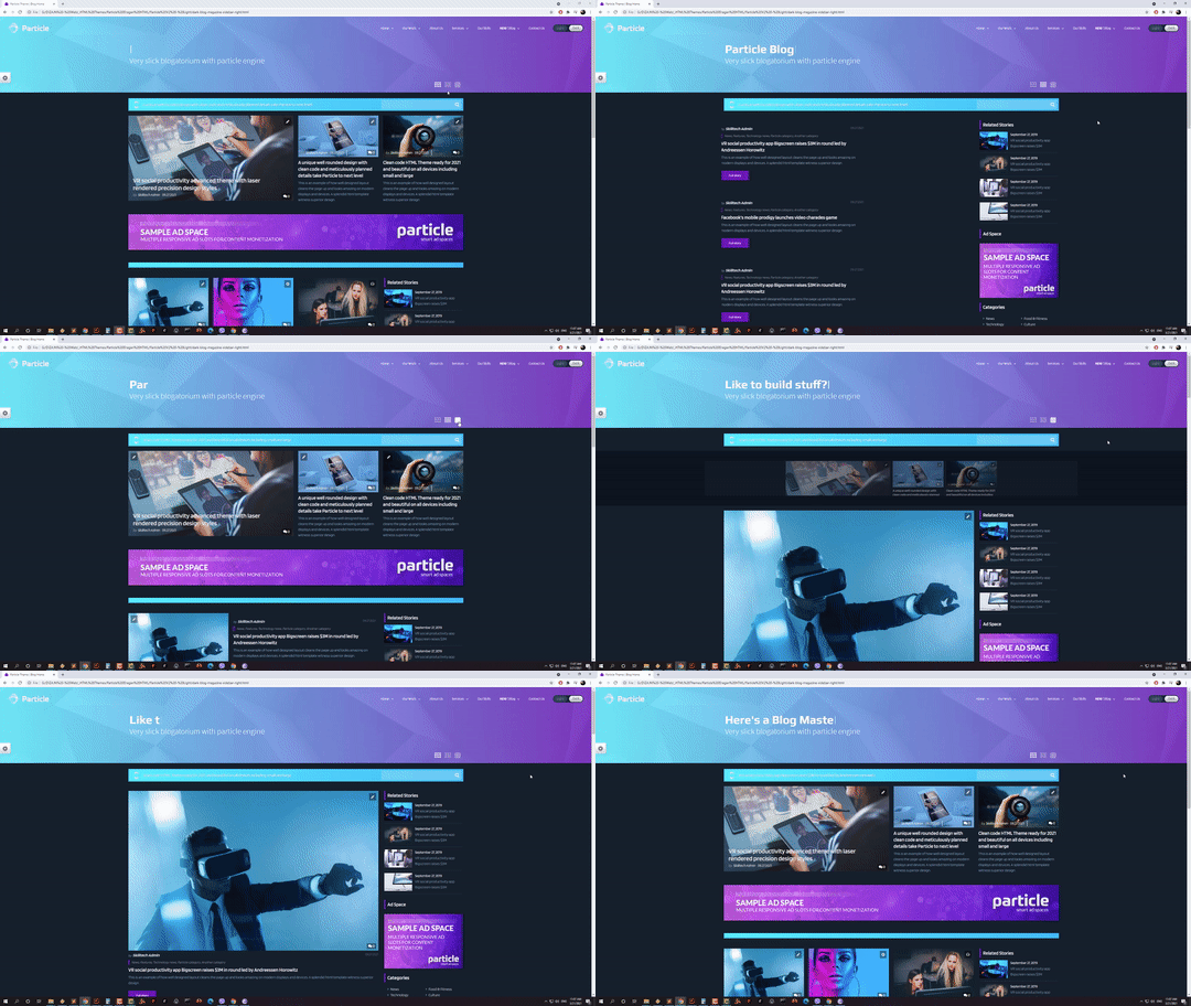
The Blog Feed Styler is a cool option that lets your users restyle the blog on the live site, i.e. they can switch between Magazine style, Casual style and Classic style in one click. Blog styler UI is present on the Blog Page(s). If you don’t want this functionality, simply remove the section marked with “Feed Style Switcher” comment from the Blog Page:
<!-- Feed Style Switcher
================================================== -->
<div class="container pa-supercontainer pa-feed-styler-container">
    <div class="row">
        <div class="col text-right">
            <div class="pa-feed-styler">
                <span class="pa-feed-styler pa-fs-magazine active"><i class="fa fa-th"></i></span>
                <span class="pa-feed-styler pa-fs-stretched "><i class="fa fa-align-justify"></i></span>
                <span class="pa-feed-styler pa-fs-classic "><i class="fa fa-square"></i></span>
            </div>
        </div>
    </div>
</div>
<!-- /.pa-feed-styler-container -->
SEO & HTML meta tags
Additionally to following HTML5 standards and having semantic code, the theme’s HTML files are already populated with useful HTML Meta tags. You should update or delete these:
- meta name=”description” – Description of your page
- meta name=”author” – Author of the page (e.g. your company)
- meta name=”keywords” – for SEO purposes, write up to 15 keywords, separated by commas
Facebook related meta tags (og tags), used when sharing the page on Facebook, to load the pretty image and text instead of a generic one:
- meta property=”og:title” – Facebook share title
- meta property=”og:description” – Facebook share description
- meta property=”og:image” – Facebook share image (suggested dimensions 1200(w) by 630(h) pixels, since 2021.)
- meta property=”og:site_name” – Facebook share “Site” (e.g. SkilltechWebDesign.com)
Navigation Menu
The menu now supports top level items (regular menu) and two levels of sub-menus. In the supplied HTMLs we have provided examples of normal menu items, menu items with sub-menu and menu items with two levels of sub-menus. Here are the examples isolated:
Normal Menu Item:
<li class="nav-item">
    <a class="nav-link hvr-underline-from-center" href="#">Menu Item</a>
</li>
Menu item with a sub-menu:
<li class="nav-item menu-item-has-children">
    <a class="nav-link hvr-underline-from-center" href="#">Menu Item</a>
    <ul class="pa-submenu-ul">
        <li class="nav-item"><a class="nav-link" href="#">Sub-menu Item</a></li>
    </ul>
</li>
Menu item with two levels of sub-menus:
<li class="nav-item menu-item-has-children">
    <a class="nav-link hvr-underline-from-center" href="#">Menu Item</a>
    <ul class="pa-submenu-ul">
        <li class="nav-item menu-item-has-children">
            <a class="nav-link" href="#">Sub-menu Item</a>
            <ul class="pa-sub-submenu-ul">
                <li><a class="nav-link" href="#">Sub-sub Menu Item</a></li>
            </ul>
        </li>
    </ul>
</li>
Drop-down behavior
In short, we recommend never linking an item that has sub-menu items inside (i.e. if you have a “Services” menu item with 5 services as sub-menus but also want to link to “Services” section, then put the link to “Services” section as the first sub-item and call it “All services” as in our example.
And longer explanation, on desktop layout, the first-level drop-downs react “on hover” and second levels dropdowns react “on click”. On mobile layout, dropdowns can be both linked and unlinked. If you link an item that has sub-items, then clicking it will follow the link URL, and clicking the drop-down arrow on the side will open the drop-down. Our advice is to never link an item which has a drop-down (sub-menus) because a large number of users will click on this item expecting a drop-down to open (indicated by an arrow) and not a lot of users will intuitively click on the arrows.
Forms
About Particle Forms
We have used Simple Forms premium plugin so you get an additional $15 worth robust solution for your forms. Even though this plugin was created by another team, it is important that you follow our instructions, because we’ve customized the forms specifically for Particle, making the installation as minimal as possible (and on the other hand limiting the full possibilities of the plugin).
Form types and locations
There are two types of forms we created: contact forms and subscribe forms. They both contain “Email” and “Name” fields and contact forms additionally contains the “Message” field. The forms are located on:
- Homepage(s) – contact form
- Blog page(s) – subscribe form (excluding pages without sidebars)
- “Single” page(s) – subscribe form (excluding pages without sidebars)
- Service Item page – contact form
- Portfolio Item page – contact form
All code on the HTML files is already done for you, but you can change the labels (e.g. write labels in your own language). Additionally, we have loaded all the form scripts and styles on existing pages.
Form setup
NOTE: If on localhost (on your local computer), leave setting up forms for last step because from the moment you turn them on, Google ReCaptcha checks will interfere with JS and in turn make the pages load for 20 seconds. The pages will load normally on live hosting with Google ReCaptcha V3 properly set up.
- Firstly find uncomment these scripts and links on your html pages:
<!-- Simple Forms -->
<!-- <link rel="stylesheet" href="assets/vendor/simple-forms/css/simple-forms-skilltech-mod.css"> -->

<!-- Delivery Form Scripts -->
<!-- <script src="assets/vendor/simple-forms/js/simple-forms-translations.js"></script> -->
<!-- <script src="assets/vendor/simple-forms/js/simple-forms.min.js"></script> -->
<!-- <script src="assets/js/form.js"></script> --> - Open the “assets\vendor\simple-forms” folder and open the config.php file
- Follow instructions inside config.php file (IMPORTANT, create/use ReCaptcha V3)
- TIP: in the SMTP_SETTINGS, SMTP_USER is actually an email from your domain name ( e.g. peter.lee@petersdomain.com ) and SMTP_PASSWORD is the password for that email. So as to not get confused.
- Open the “assets \js\” folder and open form.js file from that folder
- Follow the instrunctions inside form.js file (you should literally only enter your ReCaptcha V3 public key here)
- Done!
Form translation
You can create a translation for your language (out of the scope of our support).
- Open the file translations.php from the “assets\vendor\simple-forms\” folder
- Look for $info_strings[‘en’] and you will see the the English translation
- Duplicate everything starting from “// English” to before “// Русский “
- In your duplicate, change the two letter abbreviation to the one for your language
- In each line after “=>“, change/translate the text in between single quotation marks ‘ ‘.
- Save the file
- Open the form.js file from the “assets\js\” folder
- Look for ” lang: “en”, ” and replace “en” with your abbreviation
- Finally, use your own language on the form (labels and button) on the HTML page
Form setup on new page
If you want to add forms on other pages you will need to insert the following:
1. Style link inside the head tag
<head>

... other code ...

<!-- Simple Forms -->
<link rel="stylesheet" href="assets/vendor/simple-forms/css/simple-forms-skilltech-mod.css">

</head>
2. Form scripts at the end of the body tag
<body>

... scripts at the bottom ...

<!-- Delivery Form Scripts -->
<script src="assets/vendor/simple-forms/js/simple-forms-translations.js"></script>
<script src="assets/vendor/simple-forms/js/simple-forms.min.js"></script>
<script src="assets/js/form.js"></script>

</body>
3. Actual form HTML, where you want to place the form:
<div class="sf-wrapper">
    <form id="contact-form" action="assets/vendor/simple-forms/sendmail.php" method="post">

        <div class="form-group">
            <label>Name</label>
            <input type="text" name="name" value="" class="validate-name" minlength="2" required>
        </div>

        <div class="form-group">
            <label>Email</label>
            <input type="text" name="email" class="validate-email" value="">
        </div>

        <div class="form-group">
            <label>Message</label>
            <textarea name="message" required></textarea>
        </div>

        <div class="form-submit">
            <button type="submit" class="pa-hvr-sweep-to-right">Send now</button>
        </div>

        <div class="server-response"></div>

    </form>
</div>
It is important that the “action” attribute leads to the correct path to the sendmail.php (which is located in “assets\vendor\simple-forms\” folder. The path is already correct unless your HTML file is in a sub folder for example.
You can copy these code snippets from existing pages.
Custom form builds and changing the original code
WARNING: For changing forms behavior, adding other fields and any type of customization other than what’s described here, we will NOT provide support.
In other words, we only provide support for our template. But, if you know what you’re doing, Simple Forms is a very powerful solution and you can add other types of fields such as file uploads etc. You can also use Google ReCaptcha V2 instead of V3, or use a simple math captcha. Before doing so, it is important to completely remove our forms integration. To do so:
- Remove the link to the form.js file from the bottom of the body
- Remove the link to the simple-forms-skilltech-mod.css from the head (this is our modification of the original .css)
- Remove our form HTML from the HTML file (the form is located inside a wrapper div “sf-wrapper” remove that div as well
- NOTE: we’ve left simple-forms.min.js and simple-forms-translations.js at the bottom of the body tag. You can delete those and start from scratch but you’ll have to add them at some point.
- Follow the instructions from “assets\vendor\simple-forms\help\index.html” file
- NOTE: their CSS from simple-forms.css will probably clash with our particle-theme.css – you will have to address this yourself.
Final words
Once again, thank You for purchasing Particle HTML template. We really appreciate your support. And remember, if you like Particle go ahead and give it five stars on themeforest now, it would mean the world to us.
Have a great time using Particle!
Sincerely,
SkilltechWebDesign.com team